The Top 5 Paint Colors That Boost Property Value in California
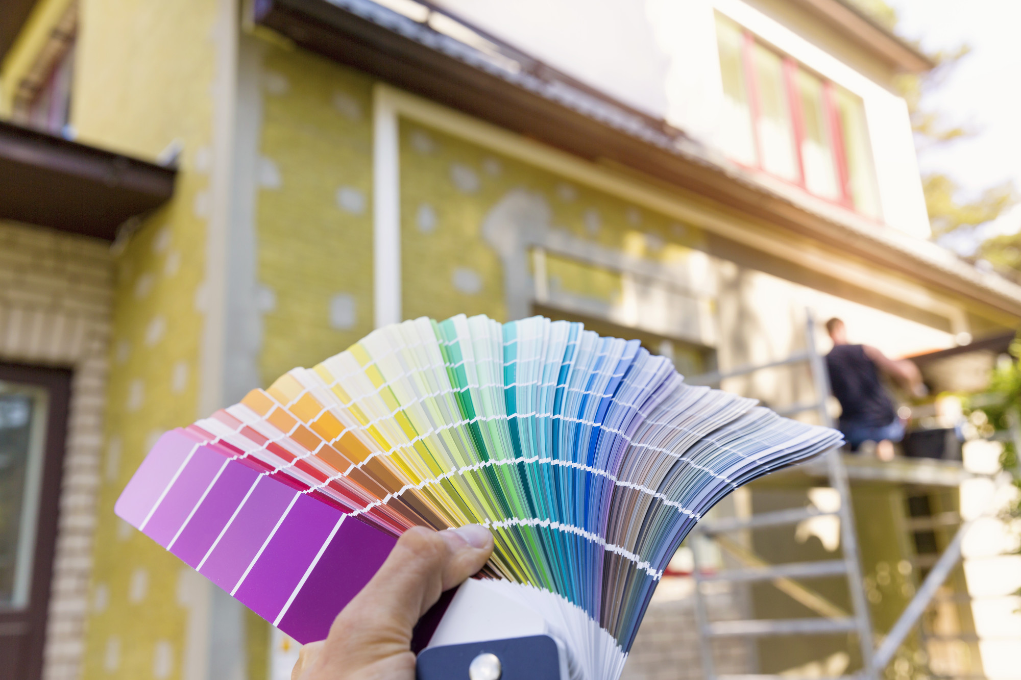
When selling your home in California’s competitive real estate market, every detail matters. As professional painters with over 15 years of experience serving homeowners from San Diego to Sacramento, we at HireAPainter.com have seen firsthand what sells a home—and what turns buyers off.
You can invest in kitchen remodels or landscape overhauls, but study after study shows that paint delivers the highest return on investment (ROI) of any home improvement.
A Zillow report found that the right paint colors can increase a home’s sale price by thousands of dollars. But the wrong color? It can actively decrease it.
So, how do you choose the right ones? It’s not just about trends; it’s about psychology, lighting, and creating a blank canvas. Based on our extensive experience and real estate data, here are the top 5 paint colors that consistently boost property value in the Golden State.
Why Paint Color is Your Secret Weapon in the California Market
Before we dive into the colors, let’s understand why this works.
– The “Blank Canvas” Effect: Buyers need to envision themselves living in your space. Neutral, well-chosen colors depersonalize the home, making it easier for them to project their own furniture and life onto the walls.
– Perceived Space and Light: The unique, bright sunlight in California can be harsh. The right color will harness that light, making rooms feel larger, brighter, and cleaner. The wrong color (too dark or too saturated) can make a room feel small and dated.
– A Signal of “Well-Maintained”: A fresh, professional paint job (with clean lines and no scuffs) sends a powerful subconscious message: this home is move-in ready and has been meticulously cared for. This builds trust and justifies a higher offer.
– Curb Appeal is Everything: For exterior paint, the first impression is the only impression that matters. The right exterior color can make your home the star of the Zillow listing and command attention from the street.
The Top 5 Paint Colors for Maximum ROI
Here are the money-makers we recommend to our clients across California time and time again.
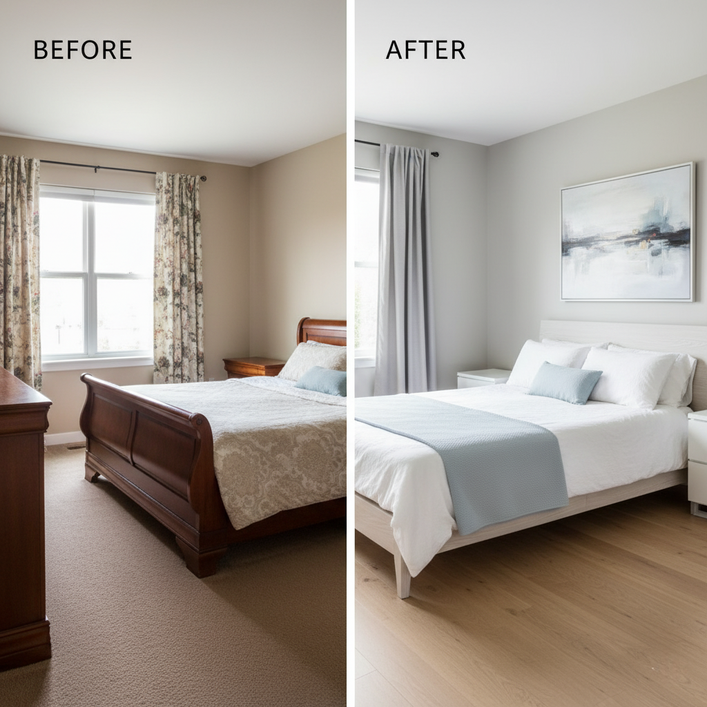
1. The Warm Off-White (or “Soft White”)
This isn’t your landlord’s stark, sterile white. We’re talking about a sophisticated white with warm, creamy, or light beige undertones. It’s the ultimate “blank canvas.”
– Why it Works: It makes spaces feel expansive, airy, and incredibly clean. It reflects California’s natural light beautifully, making every room glow. It’s versatile enough for any style, from a Spanish-style home in Los Angeles to a Mid-Century Modern in Palm Springs.
– Best For: Living rooms, hallways, entryways, and even entire-home interiors.
– Our Pro Recommendations:
– Benjamin Moore ‘White Dove’ (OC-17): A designer favorite for a reason. It’s a soft, warm white that’s never yellow or cold.
– Sherwin-Williams ‘Alabaster’ (SW 7008): A slightly warmer, creamier white that feels cozy and inviting.
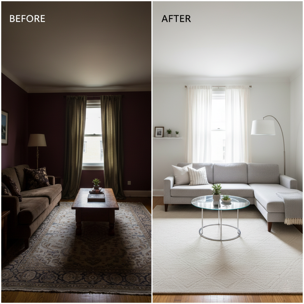
2. “Greige” (The Perfect Grey-Beige)
For the last decade, grey was king. Before that, it was beige. “Greige” is the perfect, value-boosting child of both. It’s a light, warm grey that takes the best of both worlds.
– Why it Works: Greige is the ultimate neutral. It’s warm enough to feel cozy but neutral enough to match any decor—from warm woods to cool-toned furniture. It’s sophisticated and modern without feeling cold or sterile, which is a common complaint about pure “cool” grays.
– Best For: Any room, but it’s a superstar in living rooms, bedrooms, and open-plan spaces.
– Our Pro Recommendations:
– Sherwin-Williams ‘Agreeable Gray’ (SW 7029): This is one of the most popular and value-adding paint colors in the country. It’s a true, balanced greige.
– Benjamin Moore ‘Revere Pewter’ (HC-172): A classic, slightly deeper greige that adds a touch of sophistication and depth.
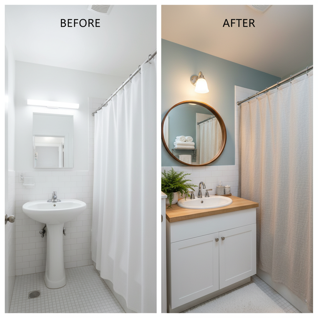
3. Light, Earthy Blue-Green (The “Spa” Color)
While bold colors are a “no” for main living areas, a specific shade of light blue or blue-green can measurably increase a home’s value when used in the right place.
– Why it Works: These colors evoke feelings of serenity, calm, and cleanliness. They have a strong association with water and nature, creating a spa-like retreat. This is a huge selling point, especially for a “California cool” aesthetic.
– Best For: Bathrooms and, in some cases, primary bedrooms.
– Our Pro Recommendations:
– Sherwin-Williams ‘Sea Salt’ (SW 6204): A breathtaking, chameleon-like color that shifts between a soft green, blue, and grey depending on the light. It’s the definition of “serene.”
– Benjamin Moore ‘Palladian Blue’ (HC-144): A slightly more pigmented blue-green that feels both sophisticated and relaxing.
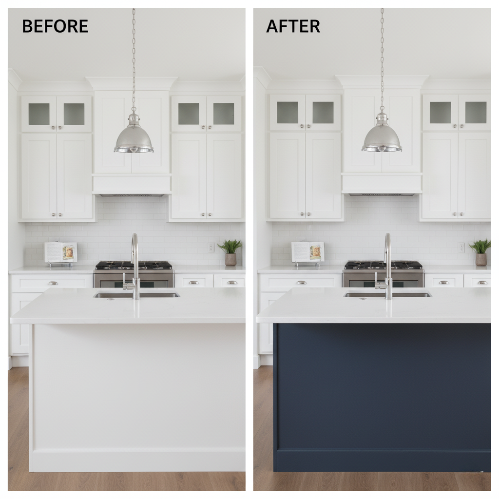
4. Classic Navy Blue (The High-Value Accent)
This one comes with a caveat: use it sparingly. A whole room in navy can be overwhelming. But as a strategic accent? It screams “custom” and “high-end.”
– Why it Works: Navy blue acts as a “new neutral.” It’s classic, timeless, and pairs beautifully with white, wood tones, and brass hardware. It adds drama and perceived value, making a space feel more expensive and thoughtfully designed.
– Best For: Kitchen islands, front doors, a single accent wall in a home office, or bathroom vanities.
– Our Pro Recommendations:
– Benjamin Moore ‘Hale Navy’ (HC-154): A deep, timeless navy that is universally loved by designers.
– Sherwin-Williams ‘Naval’ (SW 6244): A slightly brighter, true navy that makes a confident statement.
5. Soft Charcoal or Black (For Exteriors & Doors)
Nothing boosts curb appeal faster than a bold, modern choice on the exterior. While “greige” or white is a safe bet for the main body, a dark, dramatic accent is what stops buyers in their tracks.
– Why it Works: A dark grey or black front door is statistically proven to increase resale value. It contrasts sharply with lighter siding (like white or light grey), looks incredibly modern, and photographs beautifully for online listings. On a full exterior, it’s a bold, high-design move that’s very popular with modern California architecture.
– Best For: Front doors (the #1 spot!), window shutters, and garage doors. Can also be used for a full modern exterior.
– Our Pro Recommendations:
– Sherwin-Williams ‘Iron Ore’ (SW 7069): A sophisticated, soft charcoal gray that’s less harsh than pure black.
– Benjamin Moore ‘Wrought Iron’ (2124-10): A deep, rich charcoal-black that provides stunning contrast.

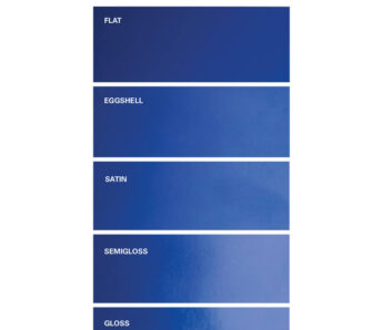
A Note on Paint Finish (Sheen)
Choosing the right color is only half the battle. The finish is just as important for a professional, durable result.
– Flat/Matte: Hides imperfections well. Great for low-traffic areas and ceilings. Not recommended for walls in a home you’re selling as it scuffs easily.
– Eggshell: Our top recommendation for most interior walls (living rooms, bedrooms). It has a very low sheen, hides imperfections well, but is much more durable and wipeable than flat.
– Satin: Has a bit more of a glow. It’s our go-to for high-traffic areas like kitchens, bathrooms, and hallways because it’s extremely easy to clean.
– Semi-Gloss: Use this for trim, baseboards, and doors. The shine highlights the architectural details and provides a durable, scrubbable finish.
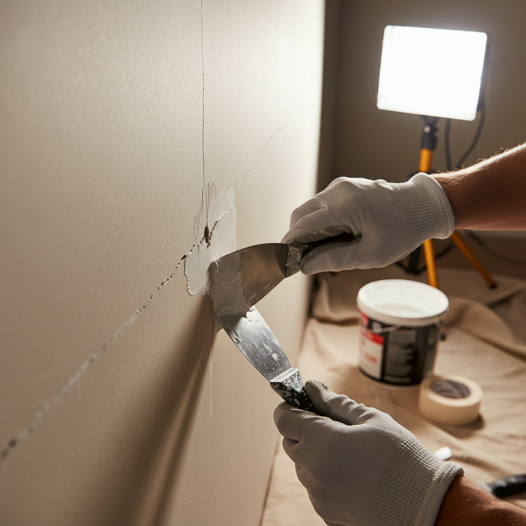
Don’t Just Paint—Paint it Professionally
You can have the perfect color, but if the execution is sloppy, it can hurt your value more than it helps. Buyers will notice:
– Paint splatters on floors or trim
– Uneven lines where the wall meets the ceiling
– Bumpy texture from un-prepped walls
– Drips and brush marks
At HireAPainter.com, we understand the California market. We know that preparation (sanding, filling, and priming) is 90% of the job. We know how to work with every architectural style, from a 1920s Craftsman to a brand-new build.
Choosing the right colors is the first step. The final step is a flawless, professional application that makes buyers feel like they’re walking into a brand new home.
🎨 Ready to Boost Your Home’s Value?
Don’t leave your biggest investment to chance. The team at HireAPainter.com provides expert color consultation and meticulous, high-quality painting services across California.
Let us help you make the smartest investment you’ll make in your home this year.
[Click Here to Get Your Free, No-Obligation Painting Quote Today!]
(FAQ)
Q: What is the single best paint color to sell a house? A: If we had to pick just one, it would be a warm off-white like Benjamin Moore ‘White Dove’ or a versatile greige like Sherwin-Williams ‘Agreeable Gray’. Both are neutral, bright, and appeal to the vast majority of buyers.
Q: Should I paint my entire house one color? A: You certainly can! Using one consistent color (like a soft white or greige) creates excellent flow and makes the entire home feel larger. We’d still recommend using a durable satin finish for bathrooms and a semi-gloss for all your trim.
Q: What colors should I absolutely avoid? A: Avoid highly personal and saturated colors. Think bold reds, oranges, purples, or dated browns. These are an immediate turn-off as buyers only see them as “a project” they’ll have to fix.
Q: What’s the best exterior paint color for a California home? A: This depends on the style. Warm whites or light greys are timeless and fit everything from Spanish to Modern homes. For a bolder, modern look, a dark charcoal (like ‘Iron Ore’) with natural wood accents is extremely popular.